
Real Estate Brochure Design: A Practical Guide
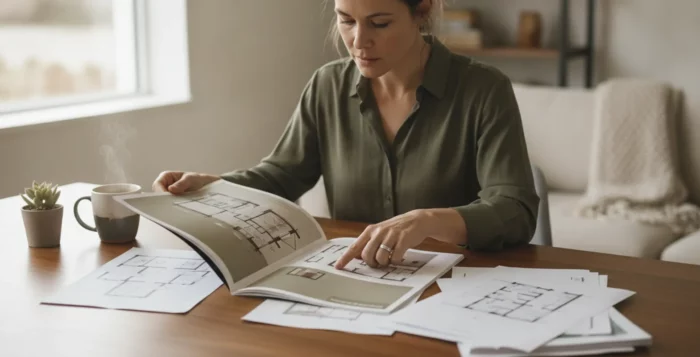
Real estate brochure design starts with a decision: what should the reader understand or do after looking at the piece? Whether you are preparing a listing presentation or a property handout, a clear purpose makes it easier to choose the message, details, visuals, and format. Build the brochure around one main idea, then give the reader a useful next step.
Explore brochure design options
Start with the job the brochure needs to do
A brochure can support different moments in an agent’s work. It might introduce your services during a listing conversation, present a property to prospective buyers, explain a neighborhood, or give visitors something useful to take from an open house. Those are different jobs, so they should not all use the same message structure.
Write a one-sentence purpose before choosing a template. For example: “Help a homeowner understand how I will market this property,” or “Give a prospective buyer a concise overview of this home.” Then decide what the reader should do next. A property handout might invite a question or a follow-up conversation; a listing presentation piece might support discussion about the proposed marketing plan.
Keep the brochure focused. If you try to include every service, property detail, market point, and credential, the main message can disappear. A useful test is whether a reader can identify the brochure’s subject and purpose after a quick glance. If the piece has two equally important jobs, consider whether two shorter materials would be clearer than one crowded brochure.
Build a clear message hierarchy
Readers do not approach a printed piece as a dense report. Help them scan it by making the most important information easiest to find. Establish a simple order:
- Lead with the subject. Name the property, service, or neighborhood clearly.
- State the main point. Give the reader a reason to continue, using accurate language rather than broad promises.
- Support it with selected details. Add facts that help the reader understand or evaluate the subject.
- Make the next step visible. Provide a direct invitation to contact you or learn more.
Use headings to divide content into meaningful sections, not to decorate every paragraph. Make headings specific. “Room to gather” can work for a feature section if the property supports that description; “Property details” is more useful than a vague heading such as “Amazing.” Avoid all-caps blocks and long paragraphs that make the brochure feel difficult to read.
Write in plain language and use short sentences. Replace generic claims such as “the best home in town” with concrete, verifiable information. A brochure should present the subject honestly and invite a conversation, not guarantee a buyer’s experience or a property’s future value. For general professional resources, the National Association of REALTORS® is a useful starting point.
Choose property details with care
For a property brochure, prioritize information that helps readers picture the home and understand its practical features. Depending on the listing and the approved information, that may include:
- Property type and location.
- Bedroom and bathroom count, dimensions, or other verified specifications.
- Notable interior or exterior features.
- Useful information about the surrounding area, when verified and relevant.
- A concise description of the layout or intended use of key spaces.
Confirm every factual detail against current listing information before the piece is printed. Check street names, measurements, room counts, and included features. Do not rely on an old draft or assume a detail remains current. If a feature needs qualification, make the wording precise rather than allowing a photograph or headline to imply more than the facts support.
For a listing presentation brochure, the useful details may be different. The reader may need a clear explanation of proposed marketing activities, the materials you plan to use, and how you will communicate. Tie those details to the seller’s goals instead of filling space with an unrelated list of services. A thoughtful personal brochure can introduce your approach, while a property handout should keep the home and its verified features in view.
Use images to clarify, not crowd
Images often carry much of a brochure’s first impression. Choose photographs that support the purpose of the piece. A property handout might lead with a strong exterior or a well-lit main living area, then use a small set of additional images to show other important spaces. A listing-presentation piece might use a relevant visual example of a marketing material or a simple diagram of the proposed process.
Use images at a size that preserves clarity in print. Avoid stretching a small image to fill a large panel, and check that crops do not remove important context. Captions can identify a room or feature, but keep them short. Leave enough open space around images and text so the design does not feel crowded. If your photo selection needs work, review practical creative marketing ideas before choosing which visuals belong in the final piece.
Consistency matters. Use a limited set of type styles and colors, and make sure text remains readable against its background. A decorative font may suit a short accent, but body copy should be easy to read at normal viewing distance. Review the design at actual size, not only on a computer screen. Ask someone who has not seen the draft to find the address, key feature, and contact details; if they cannot find them quickly, adjust the hierarchy.
Compare brochure formats before laying out content
The format affects how much information fits, how the reader holds the piece, and how it can be distributed. Compare the tradeoffs before writing to a specific panel or page count.
| Format | Works well when | Design consideration |
|---|---|---|
| Single-sheet handout | You need a compact overview for a brief conversation or event. | Prioritize a few essential facts; space is limited. |
| Bi-fold brochure | You want a cover and a few interior sections. | Plan the cover, inside spread, and back panel as distinct reading areas. |
| Tri-fold brochure | You need several short sections in a portable format. | Account for panel order and folds; keep each panel focused. |
| Multi-page booklet | The subject genuinely needs more detail or a sequence of information. | Use a clear page flow and avoid padding pages with repeated claims. |
There is no universally best format. A property overview with a small set of key details may fit on a compact piece. A seller conversation involving a marketing plan may benefit from distinct sections. The right choice depends on the reader, the amount of verified information, the distribution setting, and the action you want to encourage.
For foldable brochures, sketch the panel order before placing copy. The outside panels and inside spread are not read in the same way. Check where the cover lands, where contact information appears, and whether essential text sits too close to a fold or trim edge. For a multi-page design, make sure the opening establishes context and the final page gives the reader a useful next step. Browse tools for real estate agents as you plan how the brochure will fit with the rest of your marketing work.
Make the call to action easy to act on
A brochure should not leave the reader wondering what to do. Choose one primary action and state it plainly. Depending on the use, that could be an invitation to contact you, ask about the property, or discuss a marketing plan. Keep the action near the contact details, and make those details easy to locate.
If you include a QR code or web address, test it before approving the print file. It should lead to a relevant page, work on a phone, and match the promise made in the brochure. Keep a printed phone number or another accessible contact method where practical; the reader should not have to guess how to reach you. A next step should be specific: “Ask about the property” is clearer than “Learn more” when the brochure is a property handout.
Match the action to the moment. A brochure handed out during a property visit can invite a follow-up question. A listing-presentation piece can prompt a conversation about the proposed plan. More than one call to action may compete for attention, so make the main one unmistakable. If a brochure is part of a broader direct-mail plan, keep its action consistent with the response path used in the rest of the campaign.
Prepare content for the chosen format
Once the format is selected, edit the copy to fit it rather than shrinking the type until everything squeezes in. Draft the essential message first, then remove repetition and secondary details. If the brochure still feels crowded, reconsider whether the format is too small or the content is trying to do too many jobs.
- Write a working headline that names the subject.
- Group related details under a few clear headings.
- Use brief paragraphs and lists where they improve scanning.
- Confirm the wording and facts against current listing or marketing materials.
- Check that contact information and the next step are present.
Before production, read the copy aloud. Awkward phrases and repeated ideas are easier to catch when spoken. Then proofread the final layout, because text can shift during design edits. Check every panel or page, including small captions and the back of the piece. For example, if a tri-fold has six panels, review each one in the order a reader encounters it, then unfold it and check that the full spread still has a sensible flow.
Work through a sample brochure plan
Imagine preparing a brochure for a home with a distinctive floor plan and a covered outdoor area. Start by naming the intended reader and purpose: give a prospective buyer a concise, accurate overview to support an in-person conversation. That decision helps you exclude unrelated agent biography and general market commentary. It also helps you choose the facts that matter: the verified room count, approximate dimensions if approved, and a short explanation of how the main spaces connect.
Next, assign a job to each panel or section. The cover identifies the home and uses one appropriate lead image. An inside section presents the key details in a consistent, easy-to-scan format. Another section can show selected additional spaces with brief captions. The final panel carries the agent’s contact information and one clear invitation to follow up. This is a planning example, not a fixed template; change the order to suit the actual property and format.
Before approving the piece, compare every written detail with the current listing information, confirm that the images match the home, and test any QR code or web destination. Then ask a colleague to locate the property’s main features and the contact method without coaching. If they overlook a key point, make it easier to find rather than adding another paragraph. This small review can reveal a hierarchy problem while edits are still simple.
Use a practical approval checklist
Review the brochure from the reader’s point of view. A second person can often spot a missing detail or confusing sequence that the writer overlooks. Use this checklist before approving the final file:
- Does the piece have one clear purpose and a defined reader?
- Can someone understand the main point at a glance?
- Are property facts, measurements, names, and contact details accurate?
- Are images clear, relevant, and properly cropped?
- Does the format provide enough room for readable copy?
- Are headings, colors, and type styles consistent?
- Are fold lines, trim areas, and panel sequence checked?
- Does the call to action work and lead to the right destination?
A useful final pass is to review the piece in three ways. First, scan it for five seconds and note what stands out. Second, read the text carefully and check every factual statement. Third, inspect the print-ready layout at actual size, including small type, edges, folds, and image quality. This separates message problems from proofreading and production problems, making revisions easier to manage.
When the design is ready, choose a production and distribution approach that suits the job. A printed piece can be handed out, included in a presentation, or mailed as part of a broader campaign. Consider how it fits the audience and timing rather than treating print as a standalone task.
Frequently asked questions
What should a real estate brochure include?
Include the information that serves the brochure’s purpose: a clear subject, selected verified details, supporting images, and an obvious next step. A property handout and a listing-presentation piece have different readers, so their content should differ.
How many photos should a property brochure use?
Use enough images to explain the property without crowding the layout. The right number depends on the format and the amount of copy. Choose a small, purposeful set and confirm that each image is clear at its printed size.
Which brochure format is best for real estate?
Choose based on the amount of information, how the brochure will be used, and how the reader will receive it. A single sheet can suit a brief overview; folded or multi-page formats can organize more material, provided the extra space adds useful information.
How do I make a brochure easier to read?
Use a clear hierarchy, short paragraphs, descriptive headings, readable type, and enough space around text and images. Review the layout at its intended size and remove details that do not help the reader understand the subject or take the next step.
Thoughtful real estate brochure design connects a focused message with accurate details, a suitable format, and an easy next step. Plan for the reader first, then check every detail before the brochure goes to print.