How to Create a Real Estate Website That Will Convert Leads

Each year, the folks at realtrends.com release their annual real estate website rankings. Those rankings, regardless of the company compiling them, are always a fun read.
Realtrend’s criteria for getting a spot on their list include websites with the “best design.” In fact, they’re looking for “show-stopping websites.”
These are not always the best-designed websites to increase organic SEO or capture leads.
Nope.
It’s not just the prettiness factor that proves a real estate website “… has what it takes.” We beg to differ. The “best” real estate websites actually work for their agent-owners.
They do this by ranking in organic searches, helping to convert leads, educating visitors about the buying and selling process, and informing them about the area and its attractions.

The Quotecard Series is shown above. To learn more, Click Here.
And they do it while not annoying the visitor, making them search for the information they need, by loading at lightning-fast speeds and more.
There’s an old Duke Ellington-composed song that says it all: “It Don’t Mean a Thing (If It Ain’t Got That Swing).”
The best real estate websites are not only pretty, but they’ve also “got that swing”
A real estate website that has “that swing”:
- Features responsive design (don’t yawn–we’ll explain, in plain English)
- Is attractive in its simplicity
- Converts visitors, or leads, into prospects
- Attracts organic search engine traffic
- Is user-focused
Let’s take a look at each aspect in more detail. Then, use this information when having your real estate website built.
Responsive design
This is one of those phrases that makes eyes glaze over.
What it refers to is a website that adapts its “… content based on the browser space available. This allows consistency between what a site shows on a desktop and what it shows on a handheld device,” according to Mads Soegaard at interaction-design.org.
Why is this important? Responsive websites load quicker on mobile devices. And, since 76% of homebuyers use a mobile device when searching for homes and agents, responsiveness is critical.
Attractive in its simplicity
Think “clean” when it comes to a real estate agent’s website layout. Don’t let anything detract from your branding, from your CTAs, and from the user’s experience (fluff won’t be read anyway).
Leave a lot of white space, use short sentences and paragraphs, and take advantage of bulleted and numbered lists.
“… make your website — especially your homepage — simple and clean with easy-to-navigate buttons and tabs,” suggests the pros at quicksprout.com.
Simplicity is key, they say because sites “… with simple designs have higher conversion rates.”
Check back soon for part 2 where we’ll show you how to build a website that attracts organic search engine traffic, ensures higher conversion rates, and the extra “goodies” it should offer real estate agents.

2. The Free 6-Month Done-For-You Strategic Marketing Planner
The Real Estate Marketing Planner is a powerful 6-Month Guide that strategically defines what marketing to do and when. Four key market segments include niche Markets, geographic farming, sphere of influence, and past clients. – Click Here
3. The Free Online Real Estate Business Plan
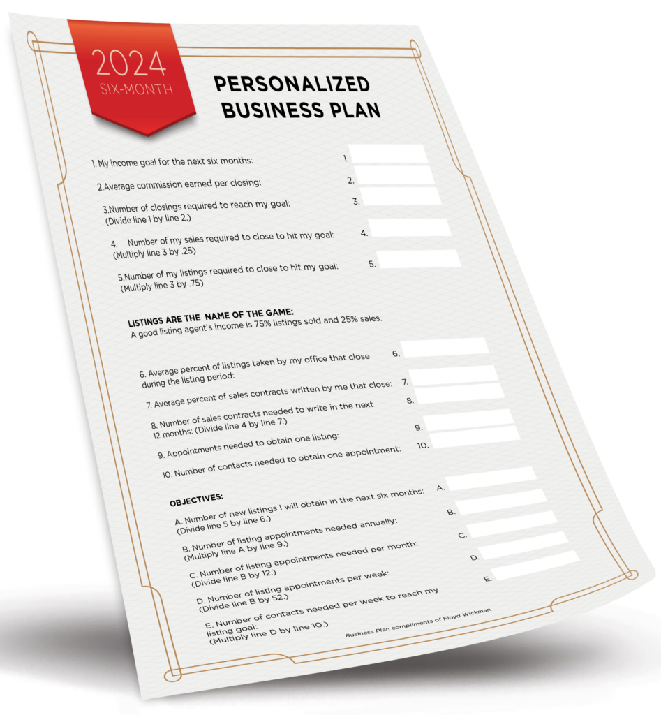
The Real Estate Business Plan allows you to enter your business goals for the year and get a breakdown of how many prospects, listings, closings, and so on are needed to reach your financial goals. – Click Here
4. The Become a Listing Legend Free eBook
Ready to take a vertical leap in your real estate career? If you’re looking for inspiration…and the tools and methods to dominate a market and go to the top in real estate…you’ll find them in this free book. – Click Here


